XO3D used evolving CAD, animation and stills to show Petalite’s charger, modular layout and cable interaction before a finished installation was available.
Before an electric vehicle charger can be photographed in a finished installation, its form and use still need to be made clear. That was the challenge behind XO3D’s visualisation project for Petalite: using evolving CAD to explain the company’s 1MW charging system through animation and still imagery. The work sits in a familiar gap between engineering design and public understanding. A CAD model can describe an object precisely, but precision alone doesn’t tell a viewer how large it is, how its parts relate or what someone is expected to do with it.
The work had to communicate several things at once: the charger’s appearance, the way its modules fit together and how a driver interacts with the charge post. Those goals can pull a visual in different directions. A view that shows the overall system may hide a useful interface detail, while a close-up can make the equipment’s scale harder to judge. The resulting animation and stills present a visual account of the design, not a product announcement or confirmation of current availability.
Build the explanation before the finish
CAD provides the geometry, but it doesn’t determine what viewers notice or understand. A clear sequence needs to introduce the equipment, show how its components relate, then direct attention to the details that explain its use. That sequence is an editorial decision as much as a technical one: the camera and timing decide which parts of the model become meaningful to the audience.
In practice, that means making deliberate choices about camera distance. A wide composition can place the charger beside a vehicle and establish their relationship. A close shot can reveal the connection point or interface. Moving between those views should preserve the context of the action, so viewers can follow what’s happening without losing their sense of location. A transition that looks dramatic but leaves the viewer unsure where the driver or equipment is can weaken the explanation.
This is more significant than it looks. For unfamiliar equipment, the sequence of views can shape a viewer’s basic understanding before they’ve read a technical description. The images don’t need to explain every engineering choice; they do need to make the central interaction legible.

The cable carries much of the story
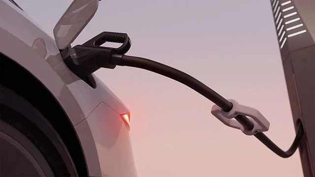
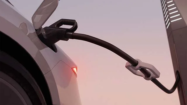
For this project, the cable needed particular attention. XO3D developed its motion through simple greycard passes, reviewing how it sagged, bent, carried weight and touched nearby surfaces before adding final lighting. The team refined that animation with Petalite while the charger design was still changing. Working this way lets the team assess movement without the distraction of finished materials and lighting.
Though small in frame, the cable connects the machinery to a familiar driver action. If it looks weightless, stiff or detached from surrounding surfaces, the interaction becomes harder to read. Natural movement helps the image explain the product, but it doesn’t demonstrate how the physical equipment performs. A convincing animation can suggest how an interaction might look; it can’t stand in for evidence about real-world operation.
And this is the part most people overlook: a cable’s motion also gives the viewer clues about scale, weight and contact. A bend that feels plausible helps anchor the charger in the scene, while an awkward one can make an otherwise polished image feel artificial. Small physical cues carry a surprising amount of explanatory weight.
Separate clarity from surface detail
A staged review helps teams focus on the right questions in sequence: first, whether the geometry and action are accurate; next, whether the camera communicates them; then, whether materials, reflections and atmosphere support the presentation. Polishing the surface before the underlying explanation works can obscure what the image needs to convey. It can also make a weak composition look finished before the team has resolved what the viewer is meant to understand.
That process also forces a useful editorial choice: which details must be visible for the audience to understand the product, and which require a separate explanation? For viewers, the goal is a legible form and interaction without asking them to decode engineering data. A visual can show where parts sit and how a person approaches the equipment, while technical documentation carries the precise information that imagery can’t reliably communicate.
If you’re working in this space, that distinction matters when product designs are still changing. The visual team needs enough current information to represent the agreed design, while leaving room to revise views as the CAD develops. The work becomes a shared review tool as well as a way to present the product. Useful, provided the images stay tied to the design decisions they’re meant to show.
CGI lets that visual explanation develop alongside the product itself. Its role is to represent the design agreed with the client. Claims about performance, compatibility or deployment need to come from Petalite’s current technical information. That boundary is important for readers too: a polished animation can make an idea feel tangible, but visual finish isn’t proof of a specification.
What the visuals can—and can’t—settle
The Petalite project illustrates why a charger image depends on more than convincing materials. Scale, framing, the order in which details appear and the physical behavior of the cable all shape whether viewers understand what they’re seeing. As product designs evolve, that clarity can be built into the visual work before a finished installation exists. For teams explaining complex equipment, the value is practical: they can examine how a design reads in context while the product is still being refined.
That said, there’s a limit to what visualisation can establish. It can make a proposed form easier to inspect, and it can help teams discuss how an interaction should appear. It can’t confirm that the equipment has been deployed, that it works with a particular vehicle or that its performance matches a claim. The distinction may seem obvious, but a finished render can carry the authority of a photograph if its status isn’t made clear.
The strongest outcome, then, isn’t simply a convincing image. It’s a visual explanation that makes the design easier to discuss while leaving technical claims to the evidence that supports them. A clearer picture. A more informed conversation.
About the author
Thomas Howcroft is Founder and Creative Director of XO3D, a UK studio creating product films, stills and interactive experiences for technology, industrial and premium consumer brands. https://xo3d.co.uk/



Discussion
Sign in to join the discussion.